Congratulations to our
BIG WINNER: Tim Wood
I have more amazing news… You are not going to believe this…
The world famous JOEL GRIMES…
(Portrait HDR Composite Master) was one of our judges and he will be awarding a signed print to our winner! So Tim gets the portable lighting combo: Rogue Flashbender & Diffuser PLUS a special award from Joel Grimes!
Joel emailed me Friday night and said he was currently teaching workshops and lecturing in Saudi Arabia, but he took the time to vote, offer a prize and email me! What a nice guy. If you ever get a chance to learn from Joel, you will be amazed! I look forward to seeing him again in person at Photoshop World this September. Another world-class presenter lives right here in Rexburg, Travis Gugelman. He also took the time to vote on his top pics as well. Travis is an amazing portrait photographer and humanitarian leader, who teaches workshops as well. Thanks, Travis!
Here is how things turned out:
1st Place: Tim Wood #7 – FOGGY BOTTOM LAYOVER
2nd Place Tie: Steven Hatch #3 – STRANDED & Sarah Luke #17 – ATTITUDE MAN
3rd Place: Jojo Sacalao #13 – RYAN JONES
Thanks to everyone who entered!
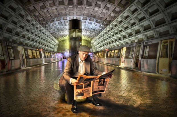
FIRST PLACE: #7 Tim Wood (Rexburg, Idaho) - FOGGY BOTTOM TRAIN
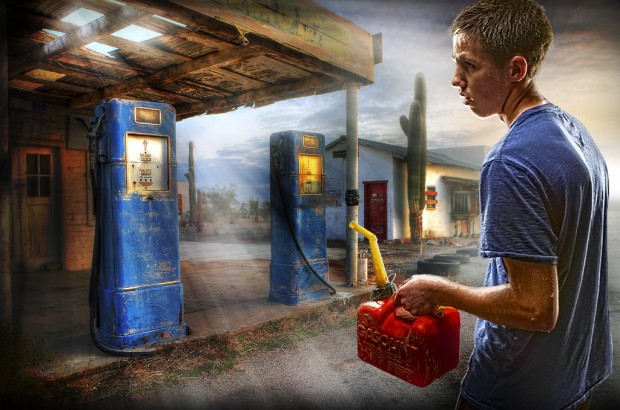
SECOND PLACE TIE: #3 Steven Hatch - Stranded (Idaho Falls)
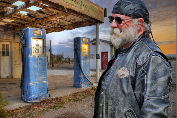
SECOND PLACE TIE: #16 Sarah Luke (Williamsburg, Virginia) ATTITUDE MAN
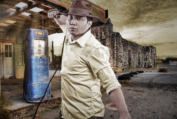
THIRD PLACE: #13 Jojo Sacalao (Vienna, Austria) - RYAN JONES
NOTE: For anyone in Southeast Idaho, I will be displaying a large format (24×36″) framed print of Tim’s winning entry this week in the BYU-Idaho Spori building foyer: Tuesday, June 26 through Sunday, July 1, along with some incredible work from my teaching assistants. Stop by and take a look, then leave a comment here! I would love to hear what you think of the showing.
We will have more contests in the future and I am open to suggestions. I think I may run one of these Portrait HDR Composite contest about three times a year. I need your input though, would you rather be able to use your own backgrounds, or did it help to have some all ready to go?
If you would like to receive email notifications, subscribe at the top right of my blog. Then you will know when I run another contest. I hope to see you back here again…Thanks!

Congrats to the winners. Well deserved for some very creative and quality work.
The first two are my absolute favorite!! Way to go guys!!
Congrats to our Big Winner Tim, and to all those who joined. 🙂
Hey thanks boss! You did a great job as well!! this was really fun to do and i’m probably going to keep working on this type of imaging, it’s really amazing to see the HDR in portraits!
Congrats Winners!!! Tim, your portrait Foggy Bottom Train is truly a winner!
Hey thanks so much!
Well done to Tim and to all the others that worked hard to produce their images all work is really cool. Wish I could be there to see it in person but maybe some images could be posted of the work for those of us that live too far away to see it.
Wow! Joel Grimes?!! How I wish he was in my contact list of friends. 🙂 Great job Caryn securing such a strong judging panel.
Congratulations Tim for a great piece of work…and to all the other entries…well done. This was a very fun project to participate in. Thanks Caryn for providing this contest.
Thanks for your comments and participation in this contest! Let’s do it again in a few months. Any ideas for the next contest?
Movie Posters would be fun.
HI Steven.. I love the idea of Movie Posters! I will do that sometime for sure. I have actually included that as an intro project in my new Professional Imaging class this fall. The students have to make it a self portrait about their own lives. Of course, I would not make limitations for my blog contest. Thanks for the idea. Let’s plan on mid September to mid October.
Also, can you leave a comment and tell everyone your process for shooting and editing your contest entry this time? I just love your how your mind works to come up with such a creative idea! I hope to meet you sometime soon. After all, we are practically neighbors! Thanks 🙂
My son is attending BYU Idaho. Next time I come up to see him, I’ll drop you a note to see if we can meet. It would be an honor to meet you.
I look forward to meeting you! Just drop me an email when you come to town. Here is a link to my new course syllabus:http://www.facebook.com/carynesplin/app_182667455607
And a link to the project page about movie posters.. just to get your creative juices flowing with ideas for your movie poster:
http://comm316.carynesplin.com/projects/project-1-movie-poster/
Congratulations for the winners! I’m looking forward for another competition!
How did you get Joel Grimes on board?? Don’t get me wrong, I’m not surprised. He’s such a nice guy, I was excited when he replied back on his Facebook fan page wall to my question!
I just emailed Joel and he got back to me in two hours, even though he was teaching workshops in Saudi Arabia! He not only picked the winners, he said he would donate a signed print to the winner! He will award it to Tim when we are at PSW! So we should all get to meet him and get a photo op with him!
Hey Tim, Steven, Sarah and Jojo… Will you each leave a comment here and tell us about where and how you took your portrait, then also tell us about your process in blending into the background. As soon as I hear from each of you, I will send a link of our final results to Joel Grimes. It wouldn’t hurt to let him know of your mad skills. 🙂
After seeing your contest and reviewing your great background HDR images, I evaluated each of your backgrounds for a story. The gas station had the strongest story in my mind…having the appearance of being closed/abandoned, the image of someone who had just walked miles to get some gas for his “out of gas” vehicle only to discover it was out of business just fit. I then went and looked at Joel Grimes’ amazing work and determined one way of integrating a subject into an HDR background was the introduction of lighting the subject and light sources in the image. I set up the light in my basement and got the spray bottle out and sprayed my son to provide the sweat look. We talked through the story until he was able to show the right posture and emotion. I ran the image through HDR toning in Photoshop to achieve a similar coloration, saturation, contrast, etc. I then ran a selection mask and copied the layer onto Caryn’s neat background. Next I added a light layer to the background to legitimize the subject lighting better. I then added light rays through the open roof by using a radial gradient adjustment layer and masking in where I wanted it to go. I darkened areas of the photo to draw the eye back into the center of the composition. I really liked the visual circle created by the eyes of the subject toward the pump…the lines of the roof leading to the pump…the rays of light that lead from the pump back to the gas can and back up the arm…to the arched back which leads you back to the subject’s face and his eyes which leads you back through the visual circle again. Final touches were softening the focus in some areas and adding some additional sweat to the subject’s face and arms.
Caryn, thank you again for some great images to work with and a fun contest to compete in. Since first place gets a signed print from Joel, does second place get an “unsigned” photocopy of a print from Joel, or a signed copy of a print from you? 🙂
Thank, Steven, for your detailed process explanation. Your image and idea are incredibly creative. I love your lighting, the sweat dripping and the forlorn look on your son’s face. What a great actor he is! I can just feel the searing heat of the Arizona sun. I was just there and it was 115 right in front of these old gas pumps on Main Street in Quartzsite, AZ… so you nailed it for sure! I LOVE, LOVE, LOVE your entry. It will go down as one of my alltime favorites. I just could not believe my eyes when I opened your email, right after I offered the contest!
Now, as for your request for a print. I would be honored to give you a signed print. You may choose anything from my site. What will it be? Do you have a certain size in mind? Do you have a frame size already in mind, that you would like me to print to?
By the way, how did you learn your incredible photography and Photoshop skills anyway? Is this your business, or a hobby? You are amazing!
I love the idea of a Caryn Esplin original. Can I get in on that?
Of course, the offer is open to you too Sarah, since you tied for second place, and you REQUESTED a signed print. Feel free to look around and find one you like. I am willing to do a 16×24, 20×30 or even. 24×36 print, if you pay the shipping? Will you be coming out here anytime soon?
I took the shot of the biker in Ashton Idaho last summer at a Mountain Man retreat with my Nikon D3100 and kit lens. Aperture was f/5.3, shutter speed was 1/500 sec, ISO was 200. In Camera Raw, I increased both the contrast and saturation before running the image through Dynamic Photo. Then, in Photoshop, I used the laso tool to loosely select just the biker. I dragged the image onto a new layer over the gas pump image, then used a mask with various brush sizes and opacities to remove the rest of the background from around the biker. I used an adjustment layer to decrease the exposer so that he matched the new background better. Thanks for the fun opportunity!
Sarah, I didn’t know you captured that portrait at the Mountain Man Rendezvous last summer! That is so awesome. You never know when those past photos will come in handy. You have a great eye to know what style will work with a background. That was a perfect marriage of images, because I truly see “seasoned” biker guys like this all around Quartzsite. It is a haven for this very type. They cruise down I-10 from Pheonix to Palm Springs, and the little town of Quartzsite is a halfway stop for travelers on the I-10. In January, this little town hosts 1 million people who park their RVs in the desert and have huge swap meets that go on for miles. It is incredible and should be on your bucket list! I also loved your darling little “golden girl.” It made me miss seeing your kids with you at Broulim’s shopping! Thanks so much for participating and you should start getting your ideas for a movie poster in September or October. You could use it for your Christmas card. Andrea Hernandez does one every year and sends it out to friends and family. Check out some of hers here…http://comm316.carynesplin.com/projects/project-1-movie-poster/
This is a project page for my new Professional Imaging course. The intro project is a movie poster (self-portrait)