GROUP 3 CONTEST ENTRIES – Contest is over!
Here is the third and final group of entries I received. Incredible work, everyone! Now we will work to see who wins the Rogue Flashbender portable lighting kit. I may just ask a few famous composite photographers to help judge this and who knows the people from Rogue may even donate another prize. Each of these digital artists used one of their portraits with my HDR background to make these portrait composites. If you want to review the contest rules, click details here: HDR Composite Portrait Contest Rules.
Everyone viewing this blog may now vote on their favorites too. I would love to hear what you think?
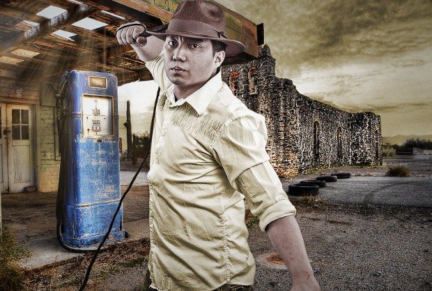
#13 Jojo Sacalao (Vienna, Austria) - RYAN JONES
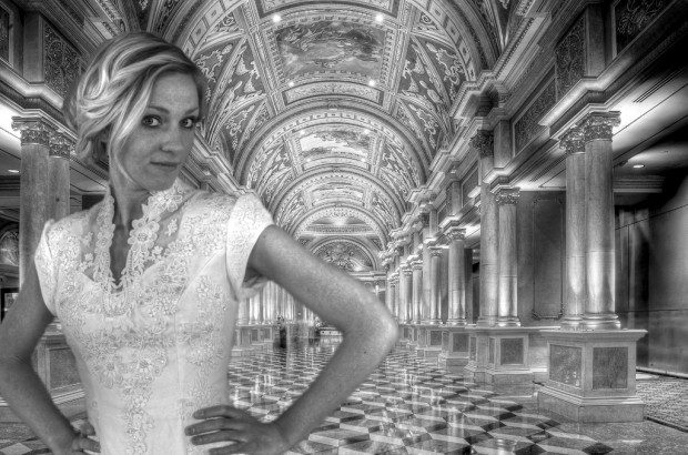
#14 Jason Wright (Rexburg, Idaho) PRETTY LADY
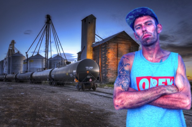
#15 Jason Wright (Rexburg, ID) ATTITUDE
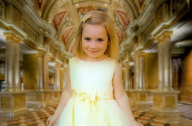
#16 Sarah Luke (Williamsburg, Virginia) GOLDEN GIRL
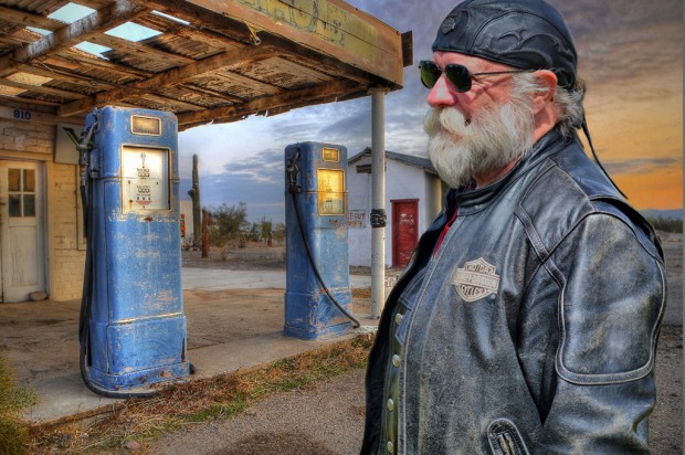
#17 Sarah Luke (Williamsburg, Virginia) ATTITUDE MAN
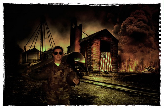
#18 Manny Quinteros (Rexburg, ID) WAR MODEL
Now, everyone… PLEASE LEAVE YOUR COMMENTS regarding your favorite entries. We have 15 total entries, so if you scroll down, you will see all 17.
THANK YOU, EVERYONE FOR ENTERING AND COMMENTING! This has been so fun to see the amazing entries come in. It is fun to have three from outside the U.S.A. I will be posting the results on MONDAY, June 25, in a blog post. So, be sure you “Subscribe” (upper right corner of blog) to receive the email notification of my post, and those who entered, please remember to finish the other items listed in the contest rules.
Thanks again!


I really like Jason Wright’s
These all look really great! I like Sarah Luke’s photos the best! I think that the blending and the story in both photos is right on. Both photos are crisp and the blending is very convincing! Great job to everyone!
My favorites are: #3 By Steven Hatch STRANDED
I like the Attitude Man! He looks tough and like it was all one photo instead of two blended together.
My favorite is Golden Girl by Sarah Luke. I love how the colors blend so well.
I like Pretty Lady. It’s very sophisticated and works well with the background.
My favorite picture is the biker guy at the gas station, just looks like he belongs there and the lighting and everything mesh really well. My next favorite is the kid holding the gas can at the gas station, looks real to me, cant even tell that it was photoshopped in. The water on his body looks legit.
And #7 Tim Wood (Rexburg, Idaho) – FOGGY BOTTOM TRAIN
I think that these 2 look very realistic. The colors match really well and they both tell a story. I think the compositions are both gorgeous and I really love the feeling of each.
I like “Stranded” the best.
My favorites in this group are Pretty Lady and Golden Girl.
1. #7 Tim Wood (Rexburg, Idaho) – FOGGY BOTTOM TRAIN
2. #12 Jerahmeel Mendoza (Manama, Kingdom of Bahrain) LOST EXPLORER
3. #13 Jojo Sacalao (Vienna, Austria) – RYAN JONES
In all of my pics for top three I thought the photographer showed an excellent ability to mirror the lighting of the original image. Their blending and use of light and shadows made it look as if the subject was actually in the original photo, making it look like one fluid image. Well done!
I love #14 Pretty Lady by Jason Wright. I love the composition and how elegant the picture is. She looks beautiful in the wedding dress and fits the background.
#15 Jason Wright, Attitude
ATTITUDE MAN is AWESOME. I really like this picture and how much it looks like the guy belongs in the picture. He’s definitely got the old rugged look going for him. I like it.
Just amazing!!!
I love the contest that you made! So many people put up beautiful pictures. From the third group I really enjoyed looking at “Pretty Lady” and “Golden Girl.” The coloring of both of those just make it look so real.
“Ryan Jones” is my favorite one. I think it blends really well with the background, and I like the pose it’s really creative and goes well with the surroundings. There’s almost a cinematic feel to it! Great Job!!
I like Tim Woods the best. They look the most realistic to me and the subjects and lighting are very good.
Sarah!!!!! you did a great job!! i love how precious your little girl looks!! I really liked how you blurred the background of the venetian to bring out the focus of her. Good Job!
Attitude Man and War Model are great photos. They both look very real. The Attitude Man fits very well into the background that was used.
There are some really great last minute entries to the contest. My favorite two from this post are the Pretty Lady and Ryan Jones. These images are a lot of fun and well compiled.
Ryan Jones looks great!!! I love how the background was made from two different images. I think the integration of the subject and the background was very well done. Great work!
All these entrees are looking really good I think my favorite in this good would have to be sarahs golden girl or manny’s war model. They convey completely different emotions but i like how they are blended. i like how manny didnt just use two pictures but thought outside the box and used several.
#16 and #17 In this group stand out in this group but the whole set is great.
My overall favorite is #3 By Steven Hatch STRANDED
I vote for #12 Jerahmeel Mendoza; the photo tells a believable story rather than an image plopped on a scene.