GROUP 2 CONTEST ENTRIES – three more days to go…
Here is the second group of entries I have received. Aren’t they amazing? The rest of you have three days left, (until June 20 – 11:00am MST) to enter this contest to win the Rogue Flashbender portable lighting kit. Just choose one of your portraits and blend it with one of my six backgrounds. Simply scroll down to my previous blog posts below or click this link to find my images and all the details here: HDR Composite Portrait Contest Rules.
Good luck!
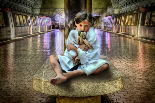
#8 Chelsee Beckstead (Castle Rock, CO) - ABANDONED
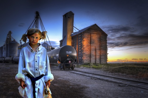
#9 - Chelsee Beckstead (Castle Rock, CO) FORGOTTEN
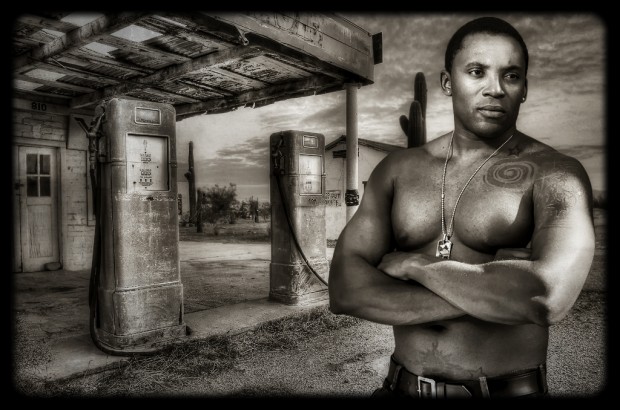
#10 Randy Brogen (Burlington, MA) HARD TIMES
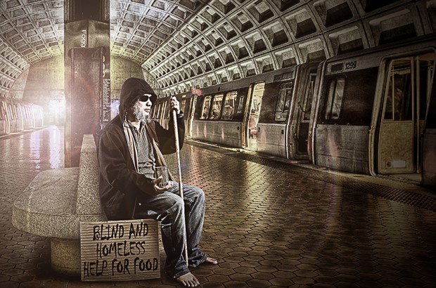
#11 Jerahmeel Mendoza (Manama, Kingdom of Bahrain) BLIND AND HOMELESS MAN
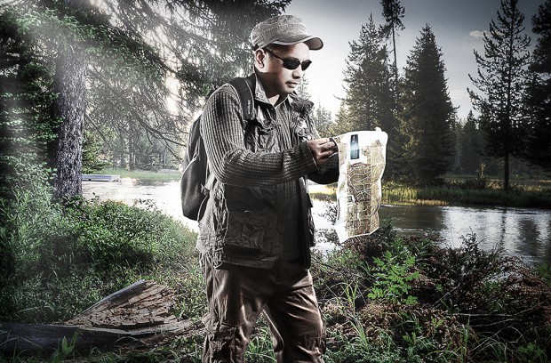
#12 Jerahmeel Mendoza (Manama, Kingdom of Bahrain) LOST EXPLORER

#8 hits the spot for me nice story to the picture(note to self) and #11 the light bleed with the slight flare makes it look really convincing to my humble eye.
Its been fun for me to take part in this and a great learning tool thanks all…
WOW! These are absolutely AMAZING! Randy and Jerahmeel did incredible jobs! I am blown away at the talent! Randy’s photo has amazing coloring and the blending looks flawless. I love the manly feel to the photo. I think I can speak for all women when I say this should be in a calendar! 🙂
Both of Jerahmeel’s photos are convincing. I love the homeless man at Foggy Bottom because this is something that you might see there on any given day. Very true to the environment. The “Lost Explorer” is also great and very well done!
I feel very honored to have my photo’s next to these two incredible photos!
So, out of the pictures that were added, my fav is the picture of the lost hiker, i think that the lighting was done quite well, so well that maybe they don’t need the prize! lol just kidding. Well done Jerahmeel.
Thanks Tim,
Your work (#7 FOGGY BOTTOM TRAIN) also good especially how you blend the image to the background using realistic shadows. But one of my favorite is (#3 Steven Hatch STRANDED), i like it because of creative concept and the emotion of the model.
agreed with Chris #8 also hit the spot for me. And i hope my entry made it to the next group =D. Good Luck to All
I like how well #12 fits right into the background. I thought it was a clever idea, nice planning of the gear.
I like the lost hiker, i like the story that is being told and he does a very good job at blending the two images. his lighting is great.
I really like the LOST EXPLORER picture. The color, lighting, and the angle of the light all matches the picture really well and it looks like the guy actually belongs in the picture. This one has my vote.
Every did so great on these, but I think my vote is going to have to go to the first orphan girl where she is sitting. I love that the focus is on her and I loved the expression on her face and the body language.
I really like “Hard Times” because the color is amazing and it definitely seems to have a very real story behind it.
Lost explorer and Homeless are amazing. I think these are the best in the contest because of the consistent lighting and realistic crop work.
I think this was a great idea for a contest! In group 3 I really love the little girl and all the detail that was done in this photo.
“Abandoned” is GORGEOUS! The little girl’s body language tells such a great story. The bear that she is holding is a great prop because it is typical for a little child to be holding an item like that when they want to feel safe or secure. Every entry is AMAZING! Impressive work!
I LOVE LOVE LOVE the photo with the homeless man at the train station! Great job blending those images, they are flawless! The light flare is nice touch.
Great work too on the hard times photo as well. The lighting is beautiful!
I’m really digging #12 “Lost Explorer.” This is my No. 1. Despite the bad composition the photo just looks real. Excellent lighting on the self portrait too. Keep up the good work.
I think that #12 is the best! It really looks like he is actually there. The lighting on the picture is just fantastic.
Oh it’s going to be hard to chose a favorite out of all of these. These are all great!! I have to admit that I really love the “abandoned” photo though. I think it really showcases fantastic composite skills with her shadow. It really looks like she’s sitting there. That’s hard to do. I love the expression on her face, what a great little model 🙂 At the same time I love Jeramiah’s photos because they also look so real. Impressive!
These are all so nicely done! The array of filters and the different feel of each photo makes this contest so great! The black and white of #10 makes this composite look incredibly realistic and the lighting on #12 is looking very realistic as well. Awesome job everyone.
My favorite image from post #2 is the Lost Explorer. I really love the lighting on the image, it looks like the subject was actually standing in that background instead of two images being combined. This image is really well done.
The Abandoned photo is a great shot. The little girl looks very realistic, and the bruises and dirt on her body really adds to the feel of the photo.
I really liked the homeless and blind man image. The lighting turned out really nice, and the overall idea was very appropriate for the background. Great job!