 1
1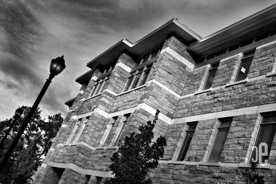 2
2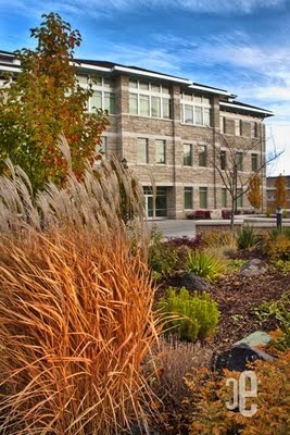
 3, 4
3, 4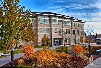 5
5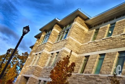 6
6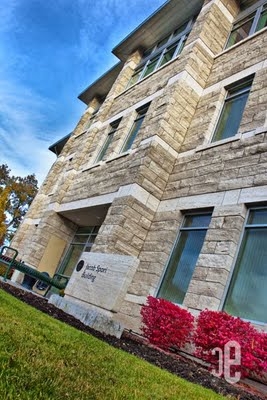
 7,8
7,8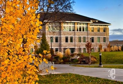 9
9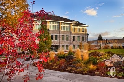 10
10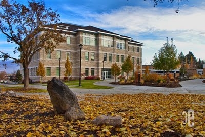 11
11
Please rank your top 3:
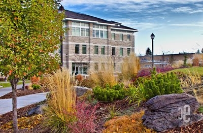
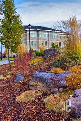
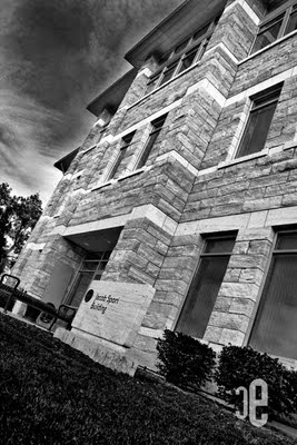
I had fun yesterday morning taking pics of the Spori Building. I was able to capture some fall color and I discovered Saturday morning is a great time to shoot on campus, because there are not as many students. I shot these all in RAW and I made some quick adjustments to the vibrance and exposure. Though I did not use bracketing (multiple exposures of the same shot) I did try the one-photo HDR effect. I needed some new photos of the Spori building for a brochure and book for the BYU-Idaho Communication Dept., which is where I teach.
I am curious which is your favorite? I need to add two or three to the layouts I am working on. Thanks for your input. 🙂


Sister Esplin, those pictures are beautiful they make me wish I was back in Rexburg. My favorites are 3,4,10.
Awesome photos! My faves are: 8,3,and 2.
These pictures turned out great! I love the vibrant fall colors. My top three favorites are 11, 9 and 3.
9 Is my favorite. I love the color of the yellow tree and how it is almost the same color in the top right corner of the window. ( I am guessing the sun) The yellow really draws you back to the building.
# 11, 3, and 2 (but 2 just because I'm artsy-fartsy). I miss you and your blogging! Where have you been??? My life is incomplete with out you, Sister Esplin!
2,9,5 are my favorites. though for a brochure i think 9 would fit best. art factor number 2 is great! good work sister esplin. see ya soon.
Oh these are amazing!! I absolutely love 1, 4, 8, &9. You are so incredible!
I have to say 8 11 and 3 in no particular order
3, 6 and 10. Though, they are all pretty close. Just seem that some are a bit more washed-out for their purpose and don't think the black-and-whites would instill the same idea that you are attempting, they I love the feel to them for other things.
11,8,5
I like 5, 8 & 3. It's so hard to choose though because I liked all of them!
-Amber
2 and 11 are my favorites. They're all amazing though.
Image 2,3,8,9 are my favorite. They are great images and really capture the light and the vibrance of the colors.
2, 5, 3. Number 2 is my favorite shot but the angle might be kind of hard for a brochure. 5 is a really good shot of the Spori building and it registers as the Spori in my mind really fast. 3 is pretty cool because it still has an artsy feel, which is fitting for the Spori building, plus I like the colors.
I'd say 5, 11, 6. It's really a pretty building, isn't it?
11, 5 and 6 ( in that order) are my favorites. I like 9 and 10 as well but the photos is quite weighted to the left which makes me not like them as much. However the colors on them are great! I'm still going to say that 11 is my overall favorite
I like 5, 8 and 10 in that order
The one thing I don't like about the black and white picture is that it's way to contrasty. The other shots look awesome. I think the colors are a little to vivid for my taste but I really like them. good job.
11, 2, 10
My favorite is 9 for the brochure. But I really like the angle in 8. And I like all the colors in 1. These are awesome.
My favorites are: 3, 1, &9!!
My favorites are 5,11,6,and 10.
I Like 5, 2, and 10. They all are really good though, tough to choose.
5, 10, 2. I really liked number 5, but I think 10 is really good with the red leaves – it adds nice color to the picture.
#9,4, and 6
I like 11 a lot because you can see the whole building and the fall colors make it very interesting. 5’s colors are rich and the sky actually draws your eye to the building. It’s a great shot as well. Then I think 10 is awesome. I love the ones with rich color and where you can see the majority of the building. So 11, 5 and 10.
My favorites are 11, 3, and 6. I love the fall colors. I really like the wide view in 11, it has a nice sky and colors. The other two have nice color and angles.
I really liked the black and white #8, I also like #11 because it's more real to what I see everyday, and #5 is pretty real as well. More color in #5 but it looks good.
I would say 5,2 and 3 though they are all really quite impressive.
#5, 8, 11.
1, 3, & 11 are my favorites.
10, 5, and 7 are my favorites!
Wow! I love #2! There's nothing more intriguing to me than a rock texture put to a harsh black and white! Very, very nice! (But of course, all of them are amazing! I think you should be the school’s official photographer!)
1, 5, & 9 are my votes. I love them!!! You're making me miss school already, wish I were there.
My favorite is #5 – and sorry it's taken me so long to get back to you about the comments… I'm emailing you right now!
2, 5, and 9. 5 probably best for the brochure; it's the best overall representation of the Spori building. 9 has a very autumn-y feel to it. Very warm. 2 is just awesome. I think it would be a cool accent photo for the brochure, although maybe not the main photo.
these photos are all absolutely gorgeous!
My favorites are 9, 10, 1 and then 7.
I love autumn. Great colors.