FIRST 1 CONTEST ENTRIES – one more week to go…
Here are the first amazing entries I have received. Nice work all of you! Everyone else has one more week, until June 20, to enter 1 or 2 composites. Come on and enter one… you know you want to! Just choose one of your portraits and blend it with one of my six backgrounds. Simply scroll down to my previous blog post below or click this link to find my images and all the details here: HDR Composite Portrait Contest Rules.
Good luck!
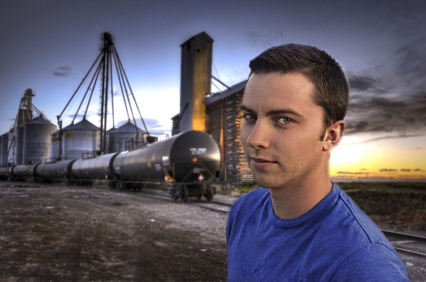
#1 Taylor Reed (Rexburg, Idaho) - SWAGGER
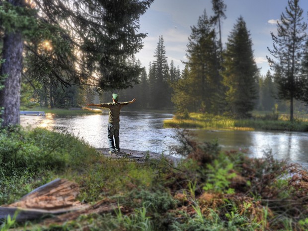
#2 Taylor Reed (Rexburg, Idaho) - THIS IS THE LIFE
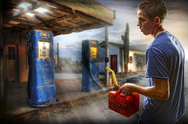
#3 Steven Hatch (Idaho Falls, ID) - STRANDED
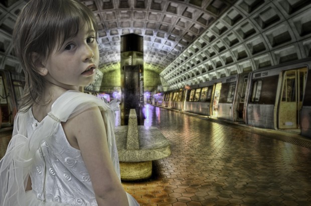
#4 Chris Rafferty (Wesgtbury, Wiltshire UK) - ABIGAIL'S PATIENCE
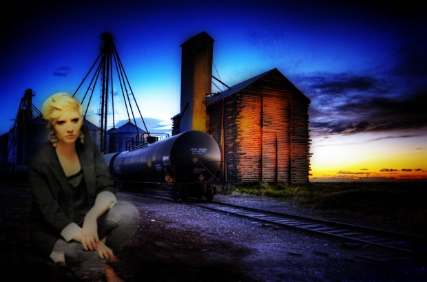
#5 Craig Hammond (Rexburg, Idaho) - TARA
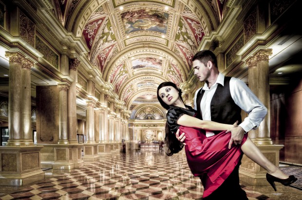
#6 Tim Wood (Rexburg, Idaho) - FINAL DANCE AT THE VENETIAN
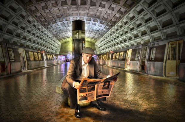
#7 Tim Wood (Rexburg, Idaho) - FOGGY BOTTOM TRAIN


Wow I’m am Humbled.Steven Hatch has made a lot of effort with stranded and Taylor Reed’s swagger Is eye catching.Tim Wood’s composite looks flawless and is my favorite.
Great first set of entries! Everyone did a great job of defining the relationship between the subject and the background. Two that stand out to me are #2 and #7. Good luck everyone!
Wow! These are all so amazing! I really like #3 Stranded. I love the feeling of this photo. It seems as if this young man has walked for miles in the rain and finally made it to the gas station. Steven really captured the exhaustion on his face. I like the light shining behind the gas station because it symbolizes the light at the end of the tunnel. The composite is VERY convincing!
I also really LOVE Tim Wood’s #6 Final Dance at the Venetian and #7 Foggy Bottom Train. The HDR, the composite, the coloring, the lighting, the shadows, and on and on and on, are all SO amazing. These are so convincing that you would never guess that they were a composite. I am inspired!
Taylor, Chris and Craig also did a great job! So wonderful!!!
Thank you Caryn for this learning opportunity!
Thnks for the comments you guys!! I agree with you all on the one with the stranded gas station pic. It was a great touch to edit the light shaft into the image to give it that extra oomph, so to speak. I really had fun making the composites of my wife and i at the Venetian. Good thing she had just the dress for the occasion!
Wow, for me entry #3 hit the spot =D, great compositing. Good Luck to all =D
#3 is so creative. I love how you made the light come in through the holes in the roof.
#7- Tim, you did a great job with both shots, but I love how well your images bled in this shot. You did a great job with the vignette, too.
Sarah, i left a comment for you on yours!! you’re so good too! We miss you guys, i wish you handt left so soon, we all would have made the perfect double date couples!!!! lol MIss you guys
I LOVED number 3! i think the light coming through adds to the picture a lot and it is so cool that he captured the heat through the mans sweat! So creative.
I really like THIS IS THE LIFE and STRANDED. They look so realistic!
My top favorite is Abandoned not only for the great lighting but also for the details like the sweat running down his face.
I also love abandoned. Lighting is great and it looks natural.
I like #7 because of the way it matches the scene with the lighting and effects. I also think the shadows were done well and the theme was set up well. I also like #3 because it tells a story and you can see his sweat and his expression match the whole photo. I like the subtle effects to the photo as well like the light coming in and his shirt drenched in sweat.
It was hard to pick a favorite, but I loved “Stranded” because of the story it tells, and the lighting and details in this piece is excellent. I also love the story “This is the Life” tells and the lighting matches perfectly with the placement of the picture.
My favorite is “Stranded.”
Abandoned is the best.
THIS IS THE LIFE. I really love this picture and the fact that you matched the colors, angle of the light, and even added a shadow behind the guy! Its all very proportional and believable.
Foggy Bottom Train is my favorite photo in this post. Tim did a great job and blending both images. It looks very realistic, as if the man was in the photo originally. Great Job!
These are incredible. My favorites on this page are #6, #3, and #2. They not only match the color and lighting, they match the tone and content of the photograph. Great job to all! But especially Mr. Wood, Mr. Hatch, and Mr. Reed.
Thanks everyone for the positive comments. Its been fun to see what people have come up with. Tim, good job man. The time you spent on your shadow paid off. It looks good. Steven coodos to you to man. love the story your pics creates.
Wow! What awesome pics! If I had to choose, I really like “Stranded”. I love the creativity and feel of the image. The editing was supreme. My next choices would probably be “Final Dance at the Venetian” and then “This is the Life”. These are all wonderful shots!
Tim, your foggy bottom train turned out so nice! you always find a way to showcase incredible pics. Way to go man, and good luck! 🙂
your the man Manny, I appreciate your style in the one you posted too!!! you have such a natural talent, i’m so glad we took this class to hone that. Sister Esplin rocks, right? lol
I really like the emotion captured in the FINAL DANCE AT THE VENETIAN. The image is really well compiled. It looks great overall.
Here is my vote:
#7 Tim Wood (Rexburg, Idaho) – FOGGY BOTTOM TRAIN
#3 Stranded, I love how it looks painted and how well the photo’s blended together.
# 6 Tim Wood, Awesome husband and wife shot! Tim, I always love the photos you take of your wife, very well done.
#4 Chris Rafferty, I love this photo because it is almost eery to me. The coloring makes the girl look a little ghostly, like she is haunting the train station! I also love the angle.