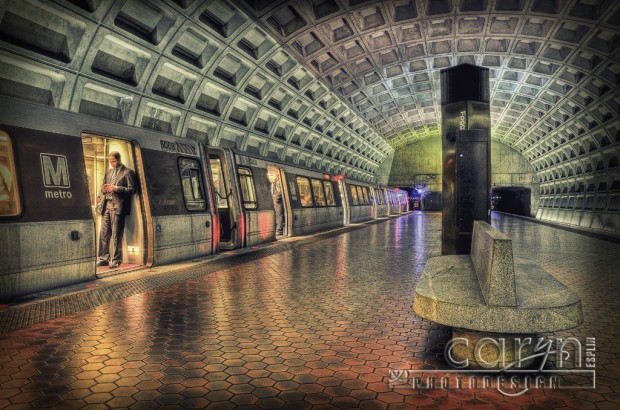
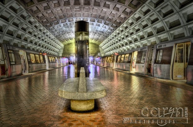
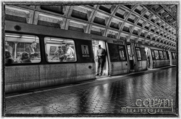
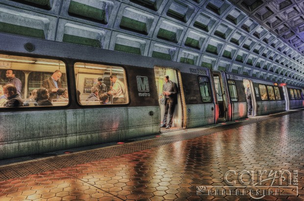
I had a few minutes to wait before I met my daughter, Rachel Esplin Odell, and her husband Scott (for an amazing dinner at Founding Farmers), so I set up my tripod to get some HDR shots of the Foggy Bottom stop on the DC Metro. It was still rush hour, so there were people everywhere! But I found that if I waited to shoot until right before the train(s) left, the platform cleared out and I could sneak in a quick three-exposure burst. I used my bracketing feature and timer to capture a dark, light and normal exposure. Then I blended them together for the effect you see here. I wanted the grungy, dark, underground look. Sometime, I want to add a person in the foreground of these shots for the Joel Grimes portrait look. I can’t decide which is my favorite. Any thoughts?
MY SHOOTING PROCESS:
1. Discreetly pulled out my Manfrotto MKC3-P01 Compact Tripod and set up near the end of the very long platform and set it up right behind a large mapboard.
2. Checked the light and found a good exposure. In this case my baseline was f/13 and 1.6 seconds. I set my Nikon D7000 to bracketing mode and used my 2-second self timer: -2, 0, +2 to take three different exposures.
3. Waited until people hurried by to get on the train, then when they were situated, I grabbed the 20 second opportunity to take several bursts before the train doors closed.
MY POST-PRODUCTION PROCESS:
1. Opened all three exposures in Photomatix Pro. I selected any ghosted areas and right-clicked to choose which exposure to use for that area. Then I tonemapped the blended result to get the darker, grungy look.
2. Opened the blended/tonemapped image in Camera Raw / Photoshop and/or Nik to add some finishing touches such as sharpening, burned edges, desaturation, etc.

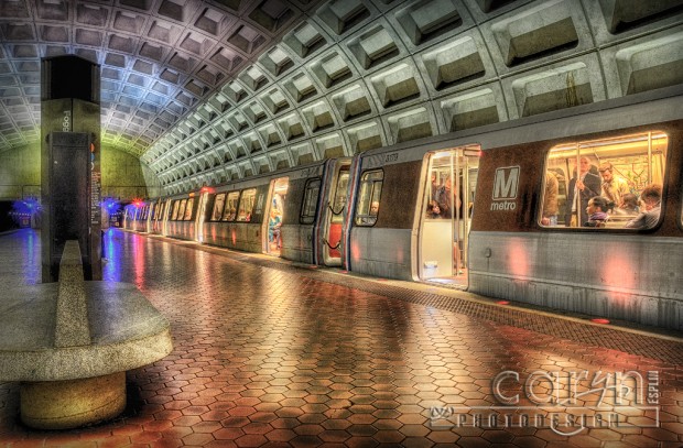

I’m partial to the second one. Love the vibrant lime and violet.
Thanks for the comment, DeLynn! The colors are interesting on that one. I hope you are well.
Oh man, I love the first one with the man texting! These are great! I still can’t believe you were so lucky to be able to get shots with nobody on the platform. These are awesome!
Thanks for the comment, Zach! I was worried the people would be a problem and I did get plenty of shots with dark ghosts blurring by. Luckily I snagged a few at just the right moment. I could have done this at a slow time, but then I would not have people in the trains, which I wanted to get. Thanks again!
OKAY! This post is my absolute favorite. You’re trip to D.C. can be summed up with these amazing shots!! Has anyone told you that you’re a Photographer Extraordinaire and Photoshop GURU!
We couldn’t be more grateful to have a person like you in our lives to teach us and share such great inspiration of the things we will one day be able to do ourselves.
Thanks!
You made my day, Dustin…. no you made my month! I am so glad you like the metro shots. 🙂
Nice work Caryn : )
I appreciate the comment, Brian. I’m glad you liked the post. I hope hear from you again!
I also love the first one. The way you captured the man texting,as well as the HDR, it’s my favorite. I will have to say that they are all great, and all for different reasons. Your D.C. trip produced some fantastic photos! Thank you so much for sharing them all.
It is always a pleasure to hear from you, Brent. I missed your comments while you were out of town. I hope you had a great trip! Thanks for the comment. 🙂
Awesome. Love these. They look like paintings. Just amazing.
Thanks, Kristy! I like the Normal Rockwell painting look. This HDR effect is fun when people are involved. Who would have known the subway would have been the place to get some good people shots. 🙂
Thanks for the feedback. I think the first is my favorite too because he is just close enough to be the focal point and be a transition to connect us to the inside of the train. I was so glad he held still for all three shots! It saved some masking in Photoshop.
I enjoyed you images of the DC Station. The feel of them made me think of this image.
http://www.lightpictureart.com/lpics_mmci/jd_dreams_l1.gif
And in my search I came across a modern Interpretation.
http://4.bp.blogspot.com/_KiL1pj6t5HA/SncsfeDhp1I/AAAAAAAAERE/bwXzsnWjkE0/s320/freewifi_large.jpg
What a compliment to be compared to this famous painting. I guess it does have the same feeling of looking on people’s lives as they carry on their normal routine.
I like the first one because the figure in the doorway gives it a good focal point. All spoiled by the watermark though. 🙁
Thanks, Tim. Sorry about the watermark. I have just had a few bad experiences with image theft when I don’t add the watermark. 🙂 I try to keep it somewhat transparent so it is not as distracting.
Beautiful images!! I am partial to the second one – the train full of people and the platform empty is gorgeous! Thanks for sharing!!
It seems to be about even between the first and second image. I just added a fifth image, which is a color version of #4. Thanks for your comment!
Love them all, but the second one is my favorite. I have family in the DC area, love using the metro when there, and wishing my closest city had a subway system.
I agree, I love riding the metro and watching all the people going their separate ways. Thanks for the comment.
I love the first and the second equally. It’s the story of the people that pull me in – the first with the man texting and the second of the man and young woman looking out the window. I also love the glow and color of the lights, as well as the reflections and lines on the ceiling. Amazing work!
Thanks, Melissa! That must be why the first two are the faves. They have people. I just added a fifth image, which is a color version of #4. What do you think of this one?
I think number two is my favorite, although I love five in color. In five, so many of the people appear to be looking at phones in their hands – too many – I think it’s a personal thing. When I think about them, I assume they are reading e-mails and my curiosity stops there, even though I know it’s DC and people are busy with life. In two, however, two of the subjects are starting off into the depot, and it leaves me to wonder what are they deep in thought about. Of course, it’s really about the story behind the image, and with the DC metro being a busy place, that might make five the perfect story. =) AMAZING job!
Thanks for the feedback, Melissa! Have a great day, and hopefully neither one of us will spend too much staring at our electronic devices. I like your insights about what we may be doing as we ride home from our busy days. 🙂
Those are really cool I love how they turned out.
Thanks, Aaron!
My favorite is #2 … I get a sense of “Norman Rockwell” in the people seen through the subway car window.
Thanks for the comparison to a Norman Rockwell! The people do make it interesting for sure. I was not sure how they would turn out with all the movement, but I think I will keep trying this same thing again. I just added a fifth image, which is a color version of #4. What do you think of this one?
Caryn, the third one is SCA-REAMING Joel Grimes! You never cease to amaze me, if my jaw is open, and eyebrows scrunched in awe looking at a computer screen, 9 times out of 10 I’m looking at Caryn Esplin’s blog.
It is always a blast to hear your critique, my friend, Andrea! Coming from you, this is a great compliment. Thank you… I just added a #5 image, which is the color version of #4. I would love to hear what you think of this one.
The first one is my fav….but they all are amazing…especially because it was rush hour. Wow!
It is great to hear from you, Konda! I just added a #5 image, which is the color version of #4. I would love to hear what you think of this one.
The first one is my fav….but they all are amazing…especially because it was rush hour. Wow!
That’s a double wow…. 🙂
I like the 2nd one. I love the colors and the angle!
These are awesome! Great photos! They really turned out! I would have to agree, my favorite one is the first image.
Wow Caryn these looks amazing! Now I wanna go to DC and check some of these places out. I’m going to have to say that I like the first one the best. I just like how the focus kind of goes straight to the dude texting and then the lines from the train leads your eyes to the rest of the photo. The editing is really interesting too, but then I’ve always liked the grungier look. I think this really fits though because when I think of an American metro, I think of a sorta run down grungy place (even though I’ve heard they are super strict with the DC metro with keeping it clean!) Very nice work, can’t wait to see more!
Caryn, these are excellent, I absolutely love the editing you did to these. So fitting for the Metro.
If you are taking a tally, I would say the first one is my favorite. I love the focal point, the lines, the Metro logo, all of it.
Hi there Caryn,
The second one is my favourite. Would just love a canvas of it!
Rory.
🙂